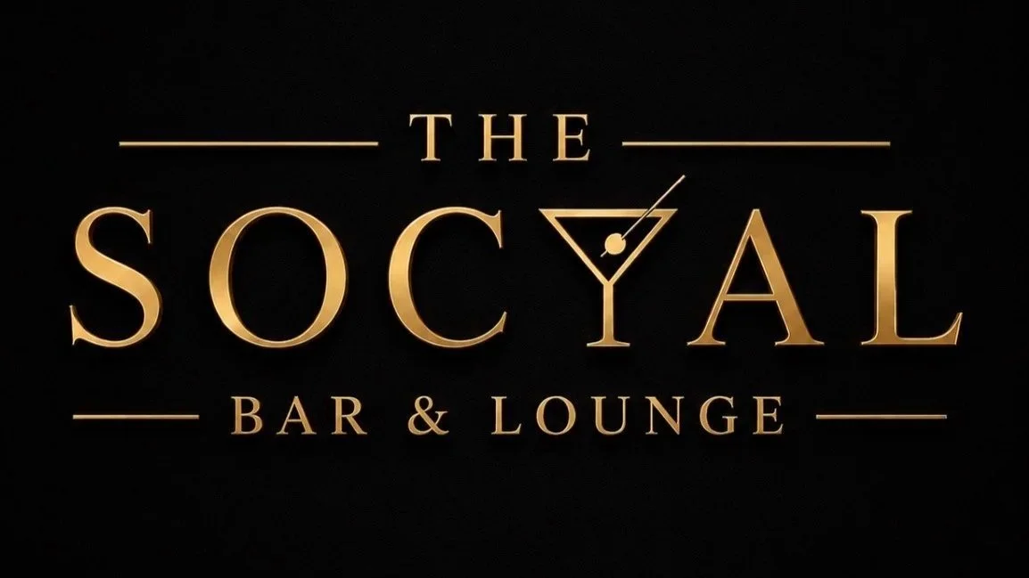
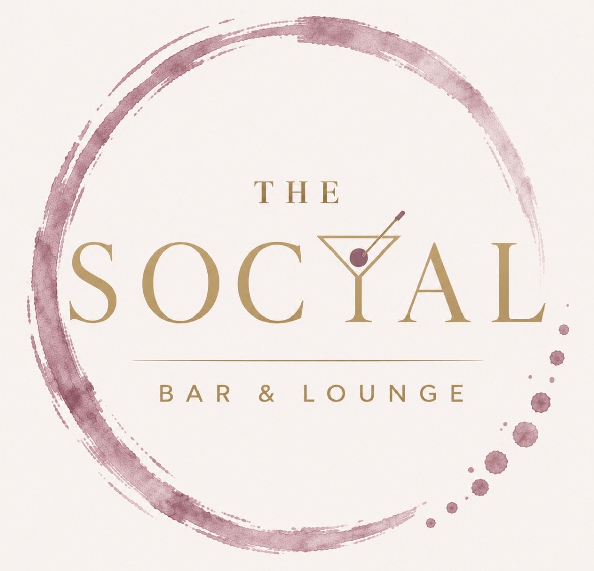
With an exclusive martini menu being part of The Social experience, we wanted our logo to reflect that. A little martini inspiration, a creative twist on the lettering, and an identity that feels entirely our own.
Eye-catching? Memorable? That’s the idea. A conversation starter? Absolutely!
However you say it — Social, or with a little SOCYAL twist — the meaning remains the same.
Same pronunciation. Same connection. Just a little more personality.
We didn’t set out to look like everyone else. We set out to create something people would notice, remember, and talk about.
After all, the best brands don’t always follow convention. Sometimes they create their own.
The Signature | Sophistication with a Twist
Our signature black-and-gold logo reflects the other side of The Social: timeless, elevated, and just a little unexpected.
With an exclusive martini menu being part of our experience, we wanted to incorporate that element into our identity. Rather than simply placing a cocktail glass beside our name, we made it part of the lettering itself.
The martini-inspired Y is a subtle departure from convention. It's intentional, recognizable, and gives our signature a personality of its own.
Classic at first glance. A little playful upon closer inspection.
The Circle | Connection & Community
A nod to the very meaning of SOCIAL.
A circle has no beginning and no end. It represents unity, connection, and bringing people together everything we envision The Social to be.
The dusty-rose watercolor adds warmth, movement, and a touch of personality, balancing the sophistication of our brand with an inviting, approachable feel.
Because at the heart of The Social, it's never just about what's in your glass. It's about who's around you.